Testing document accessibility
Last updated February 2025
Use this guide to learn how to test document accessibility in Microsoft Word and PowerPoint, Google Docs and Slides, and PDF documents using each platform’s built-in accessibility checkers.Quick tips
1. Learn the fundamentals
You need to follow the same core steps for accessibility regardless of your content’s format. This fundamentals guide gives you the basics to get started.2. Learn the best practices for document accessibility
Follow these basic steps to increase the accessibility of your Word, HTML, PowerPoint, PDF, and Adobe InDesign documents, as well as email communications.3. Test with automated tools
When creating documents in Microsoft Office 365, Google, or Adobe Acrobat, you can use automated accessibility checkers to begin making your content more accessible.4. Perform required manual testing
While automated testing is a great first step, manual testing is always needed. Learn how to manually check your documents for accessibility.Automated testing
Automated accessibility checkers search your files for accessibility barriers, and then generate a report that lists the issues and provides guidance on how to fix them. Use the following instructions to run automated accessibility checks in Microsoft Office 365, Google, and Adobe Acrobat.
Use the desktop versions of each Microsoft application for this process, as some accessibility issues cannot be fixed in a web browser using the guided accessibility checker.
You can access Microsoft’s built-in accessibility checker in any Word document, PowerPoint presentation, or Excel spreadsheet. With any file open, select Review in the ribbon at the top, then select Check Accessibility. The accessibility checker will open in a panel on the right.
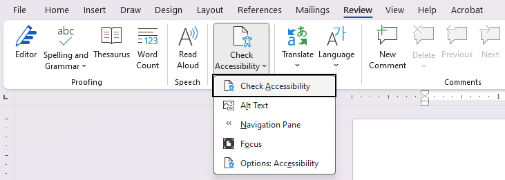 The checker will list accessibility issues and warnings in the following categories: Color and Contrast, Media and Illustrations, Tables, Document Structure, and Document Access. PowerPoint’s accessibility checker also checks for slide titles and logical reading order.
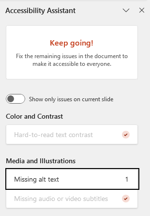
When the checker does not find issues, a checkmark will appear beside each issue type that was scanned.
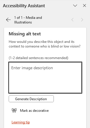
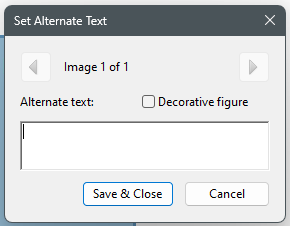
Click directly on the issues the checker finds (for example, “Missing alt text”) and you will be guided through the process of fixing it (for example, adding alt text or marking the image as decorative).
The checker will list accessibility issues and warnings in the following categories: Color and Contrast, Media and Illustrations, Tables, Document Structure, and Document Access. PowerPoint’s accessibility checker also checks for slide titles and logical reading order.
When the checker does not find issues, a checkmark will appear beside each issue type that was scanned.
Click directly on the issues the checker finds (for example, “Missing alt text”) and you will be guided through the process of fixing it (for example, adding alt text or marking the image as decorative).
 For more information, read Microsoft Support’s Improve accessibility with the Accessibility Checker guide and WebAIM’s Word and PowerPoint Accessibility Evaluation Guide.
The checker will list accessibility issues and warnings in the following categories: Color and Contrast, Media and Illustrations, Tables, Document Structure, and Document Access. PowerPoint’s accessibility checker also checks for slide titles and logical reading order.
When the checker does not find issues, a checkmark will appear beside each issue type that was scanned.
Click directly on the issues the checker finds (for example, “Missing alt text”) and you will be guided through the process of fixing it (for example, adding alt text or marking the image as decorative).
For more information, read Microsoft Support’s Improve accessibility with the Accessibility Checker guide and WebAIM’s Word and PowerPoint Accessibility Evaluation Guide.
Check your Google Docs, Slides, and Sheets for accessibility using Grackle, a suite of extensions that are available to all of UW–Madison at no cost.
To install Grackle, make sure you are signed in to Google with a UW–Madison account. We recommend using a Chrome profile to avoid being asked to sign in to Grackle every time you open your browser.
When you are signed in, open any Google Doc and follow these steps:
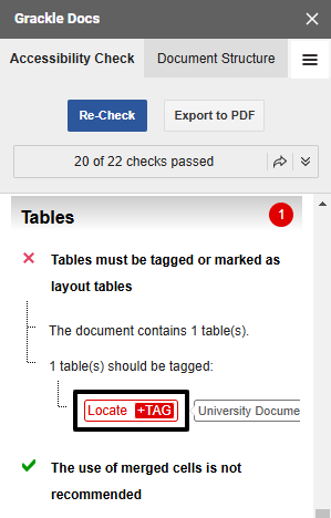
 For Google Docs, the checker will list accessibility issues and warnings in the following categories: Document, Images, Headings, Tables, Landmarks, and Contents. The categories vary slightly for Slides and Sheets.
A green checkmark will appear beside each issue type when the checker does not find an issue. You can select any issue to expand it and read more details on what was checked.
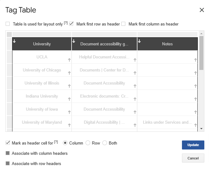
A red X will appear beside each issue type that requires review. Click on the action buttons below the issue description (for example, “Tag” if the issue is an untagged table) and you will be guided through the process of fixing the issue.
For Google Docs, the checker will list accessibility issues and warnings in the following categories: Document, Images, Headings, Tables, Landmarks, and Contents. The categories vary slightly for Slides and Sheets.
A green checkmark will appear beside each issue type when the checker does not find an issue. You can select any issue to expand it and read more details on what was checked.
A red X will appear beside each issue type that requires review. Click on the action buttons below the issue description (for example, “Tag” if the issue is an untagged table) and you will be guided through the process of fixing the issue.
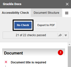
 Select “Re-Check” at the top of the panel to refresh the results after fixing an issue.
 For more information, read UC Berkeley’s step-by-step guides for Grackle Docs, Grackle Slides, and Grackle Sheets.
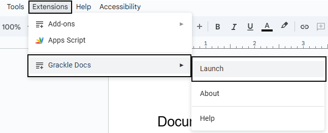
- Navigate to Extensions in the document’s menu bar.
- Select Add-ons, then Get Add-ons.
- Search for “Grackle” in the Google Workspace marketplace. Grackle Docs should be the first extension in the search results.
- Install and launch Grackle Docs.
- Repeat this process for Google Slides and Google Sheets. The Grackle add-ons are called Grackle Slides and Grackle Sheets, respectively, in the Google Workspace marketplace.
For Google Docs, the checker will list accessibility issues and warnings in the following categories: Document, Images, Headings, Tables, Landmarks, and Contents. The categories vary slightly for Slides and Sheets.
A green checkmark will appear beside each issue type when the checker does not find an issue. You can select any issue to expand it and read more details on what was checked.
A red X will appear beside each issue type that requires review. Click on the action buttons below the issue description (for example, “Tag” if the issue is an untagged table) and you will be guided through the process of fixing the issue.
Select “Re-Check” at the top of the panel to refresh the results after fixing an issue.
For more information, read UC Berkeley’s step-by-step guides for Grackle Docs, Grackle Slides, and Grackle Sheets.
To learn about PDF accessibility for beginners, read WebAIM’s PDF Accessibility guide. To effectively test and create accessible PDFs, it is important to understand what PDF tags are and how they support assistive technologies such as screen readers.
 Across all applications, “Print to PDF” does not generate a tagged PDF, so please do not use this option unless you are creating a PDF that is for print use only.
 In the Accessibility Checker Options dialog that appears, ensure all options are checked, then select Start Checking. The accessibility checker will open in a panel on the side.
 The checker will list accessibility issues and warnings in the following categories: Document, Page Content, Forms, Alternate Text, Tables, Lists, and Headings.
 If issues have been found, the affected categories will appear in bold text with the number of issues found in parentheses. To address each issue, expand the category and then right-click on the issue to Fix it through Acrobat’s guided process. If the Fix option is not available, select Explain to open an Adobe help page where you can read more about the issue and learn how to fix it manually.
Some issues may affect multiple elements throughout the document. For example, images that are missing alt text will be flagged as a single issue, “Figures alternate text,” even if there are multiple images with this issue. To resolve, expand the issue and fix the affected elements one by one.
If issues have been found, the affected categories will appear in bold text with the number of issues found in parentheses. To address each issue, expand the category and then right-click on the issue to Fix it through Acrobat’s guided process. If the Fix option is not available, select Explain to open an Adobe help page where you can read more about the issue and learn how to fix it manually.
Some issues may affect multiple elements throughout the document. For example, images that are missing alt text will be flagged as a single issue, “Figures alternate text,” even if there are multiple images with this issue. To resolve, expand the issue and fix the affected elements one by one.
 If no issues are found, the list in the Accessibility Check panel will appear without bold text calling out the number of issues — except for the Document category, which always requires manual checks for color contrast and logical reading order.
To learn more about making PDFs accessible, take the LinkedIn Learning course Creating Accessible PDFs. The course includes guidance on how to create accessible source documents before exporting to PDF, and how to remediate a PDF for accessibility if you do not have access to edit the source document.
If no issues are found, the list in the Accessibility Check panel will appear without bold text calling out the number of issues — except for the Document category, which always requires manual checks for color contrast and logical reading order.
To learn more about making PDFs accessible, take the LinkedIn Learning course Creating Accessible PDFs. The course includes guidance on how to create accessible source documents before exporting to PDF, and how to remediate a PDF for accessibility if you do not have access to edit the source document.
Accessible source documents
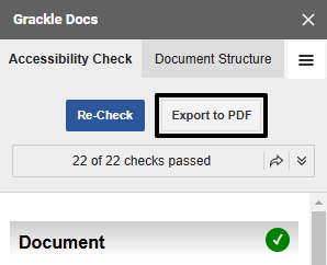
When creating PDFs, begin with an accessible source document whenever possible. “Source document” refers to the original document from which the PDF was exported. Common sources are word processing applications, such as Microsoft Word or Google Docs, and page layout applications such as Adobe InDesign. For accessibility resources and tips on using these applications, review the Document accessibility guide. If the source document is accessible, most documents created in Microsoft applications will be tagged properly when exported to PDF. When creating a PDF from a Google Doc or Slides presentation, use Grackle to check your document for accessibility and select the “Export to PDF” button to generate a tagged PDF.
Across all applications, “Print to PDF” does not generate a tagged PDF, so please do not use this option unless you are creating a PDF that is for print use only.
Acrobat accessibility checker
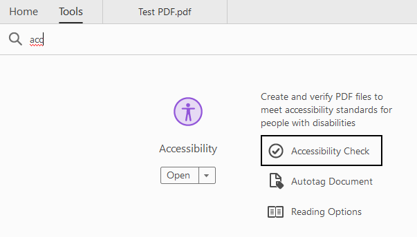
Before sharing any PDF for online use, run Adobe Acrobat’s built-in accessibility checker. Open any PDF with Acrobat Pro and select Accessibility from the Tools panel, then select Accessibility Check. (If you do not have Accessibility in your Tools panel already, you can search for it in the Tools tab and open Accessibility Check from there.)
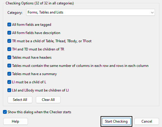
In the Accessibility Checker Options dialog that appears, ensure all options are checked, then select Start Checking. The accessibility checker will open in a panel on the side.
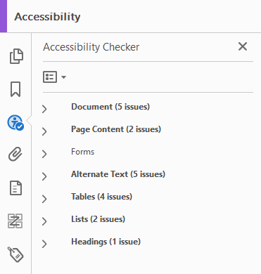
The checker will list accessibility issues and warnings in the following categories: Document, Page Content, Forms, Alternate Text, Tables, Lists, and Headings.
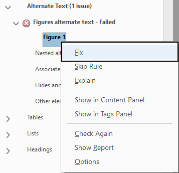
If issues have been found, the affected categories will appear in bold text with the number of issues found in parentheses. To address each issue, expand the category and then right-click on the issue to Fix it through Acrobat’s guided process. If the Fix option is not available, select Explain to open an Adobe help page where you can read more about the issue and learn how to fix it manually.
Some issues may affect multiple elements throughout the document. For example, images that are missing alt text will be flagged as a single issue, “Figures alternate text,” even if there are multiple images with this issue. To resolve, expand the issue and fix the affected elements one by one.
If no issues are found, the list in the Accessibility Check panel will appear without bold text calling out the number of issues — except for the Document category, which always requires manual checks for color contrast and logical reading order.
To learn more about making PDFs accessible, take the LinkedIn Learning course Creating Accessible PDFs. The course includes guidance on how to create accessible source documents before exporting to PDF, and how to remediate a PDF for accessibility if you do not have access to edit the source document. Manual testing
Even if your document passes all the automated accessibility checks, this does not guarantee your document is accessible — it simply means the automated checker did not find any issues. In their Automated Accessibility Coverage Report, Deque reports that automated testing detects 57% of accessibility barriers. It is still important to manually test the document for accessibility.
Color contrast
WebAIM’s color contrast checker is a helpful online resource for testing color contrast. Consider downloading the free Colour Contrast Analyser (CCA) tool for checking color contrast outside of a web browser. Both of these contrast checkers include a color picker (eyedropper) tool for easy identification of a color when you don’t know its hex value. The Web Content Accessibility Guidelines (WCAG) 2.1, Level AA, state that text and images of text must have a contrast ratio of at least 4.5:1 against their background. If the text is large (above 18 point regular or 14 point bold), the required contrast ratio is at least 3:1. In addition to checking text contrast, ensure that any graphics required to understand the content have a contrast ratio of at least 3:1 against their background. Text or images of text that are part of a logo or brand name have no contrast requirement. Additionally, graphic elements that are pure decoration do not have a contrast requirement.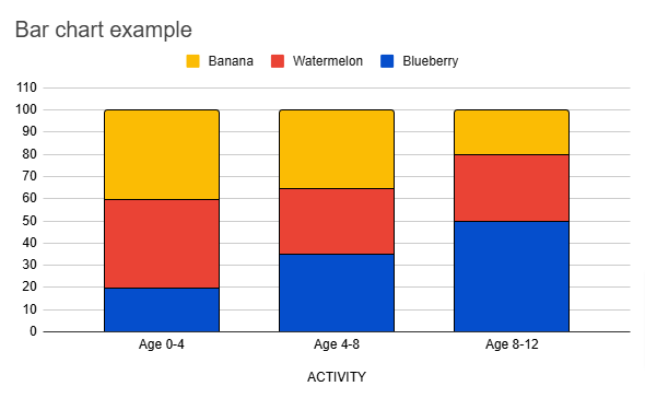 In this example image of a stacked column bar chart, the yellow color used to represent Banana has a 1.7:1 contrast ratio against the white background. This does not meet the required 3:1 contrast ratio for graphics. To address this, a black outline is added around each stacked portion within the bars to help the different colors stand out from the background and from each other.
Even when text and graphics meet contrast requirements, people who are color blind or have other visual disabilities may not be able to distinguish the elements from one another. Avoid relying on color alone to communicate information (for example, color-coded graphics like the bar chart example image) — instead, use other indicators of meaning like text labels or different shapes and patterns in addition to color.
In this example image of a stacked column bar chart, the yellow color used to represent Banana has a 1.7:1 contrast ratio against the white background. This does not meet the required 3:1 contrast ratio for graphics. To address this, a black outline is added around each stacked portion within the bars to help the different colors stand out from the background and from each other.
Even when text and graphics meet contrast requirements, people who are color blind or have other visual disabilities may not be able to distinguish the elements from one another. Avoid relying on color alone to communicate information (for example, color-coded graphics like the bar chart example image) — instead, use other indicators of meaning like text labels or different shapes and patterns in addition to color. Magnification
Make sure that your documents can be magnified up to 400% without text or graphic elements becoming blurry or pixelated.Keyboard
To learn about keyboard navigation for beginners, read WebAIM’s Keyboard Accessibility guide. If you primarily navigate with a mouse, this is a great opportunity to familiarize yourself with the standard keystrokes for most online interactions. To test your PDF documents for keyboard accessibility, verify that all interactive elements (links, buttons, form fields — essentially, any element that can be clicked with a mouse) can be selected when using only a keyboard to navigate. The Tab key is typically used to navigate forward, while Shift+Tab is used to navigate backward. Use the Enter key or space bar to select. It is also important to check for keyboard focus outlines, which indicate where your “keyboard cursor” is on the page, and the order in which elements on the page receive focus.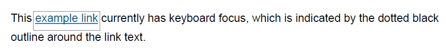
Screen reader
The Center for User Experience recommends screen reader testing with NVDA for Windows or VoiceOver for Mac. NVDA is a free application, and VoiceOver is built into all Apple devices. To learn about screen reader navigation for beginners, read WebAIM’s guides on Testing with NVDA or Testing with VoiceOver. These guides include information on how to launch your screen reader, common keyboard shortcuts for navigating a page using your screen reader, and recommendations for configuring your screen reader preferences. When testing a document with a screen reader, check for the following:- Use of true headings and true bulleted lists
- Interactive elements are announced properly
- Tables are announced properly — they have designated header rows or columns, and they do not have empty or merged cells
- Logical reading order — if content is announced out of order, there might be issues with the PDF’s tag structure
Other resources
WebAIM has an interactive WCAG checklist that may be a helpful resource as you test your online documents and other digital resources. Select 2.1 and AA to filter your checklist to show only the standards required by UW–Madison’s Digital Accessibility Policy. For more information, review the WCAG 2.1 guidelines on W3.org.The Center for User Experience
At the Center for User Experience, we are committed to working with you to make digital spaces more accessible, usable and inclusive for all students, faculty and staff at UW–Madison. We help the university follow its Digital Accessibility Policy by offering free evaluation and consultation services to all UW–Madison community members. For guidance on complying with digital accessibility requirements, visit Digital accessibility and the Americans with Disabilities Act (ADA).
Get in touch
- Meet with us: Book a quick chat with one of our team members to ask any questions you have.
- Start a project with us: We support accessible design and development. Fill out our Let’s Connect form to begin working with us on your project or to request an accessibility evaluation.
- Email us: Not sure if you’re ready to meet? Email us to start talking and figure out what to do next.